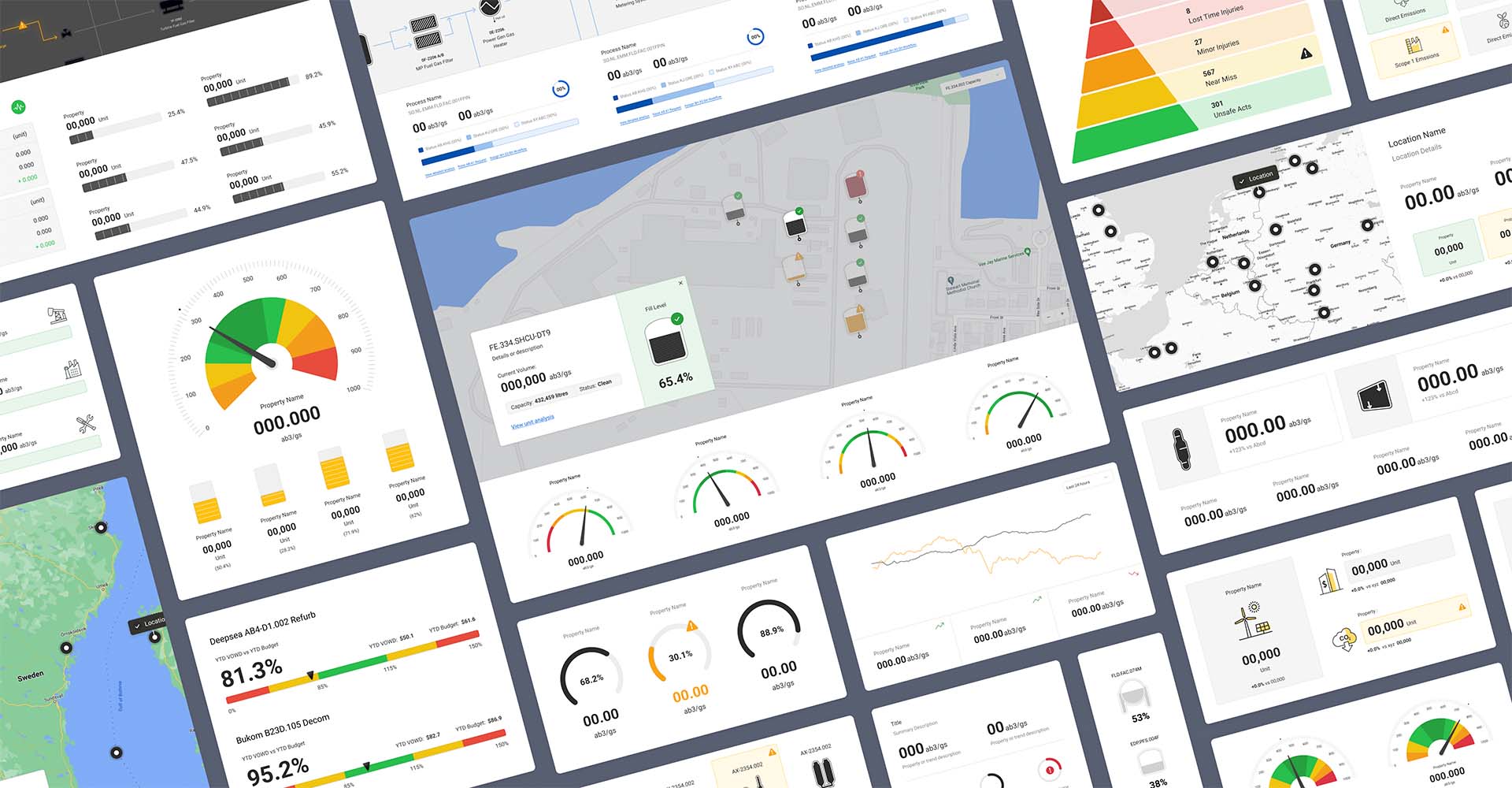
Aspen Enterprise Insights
Transforming the way users gather, shape and visualise data
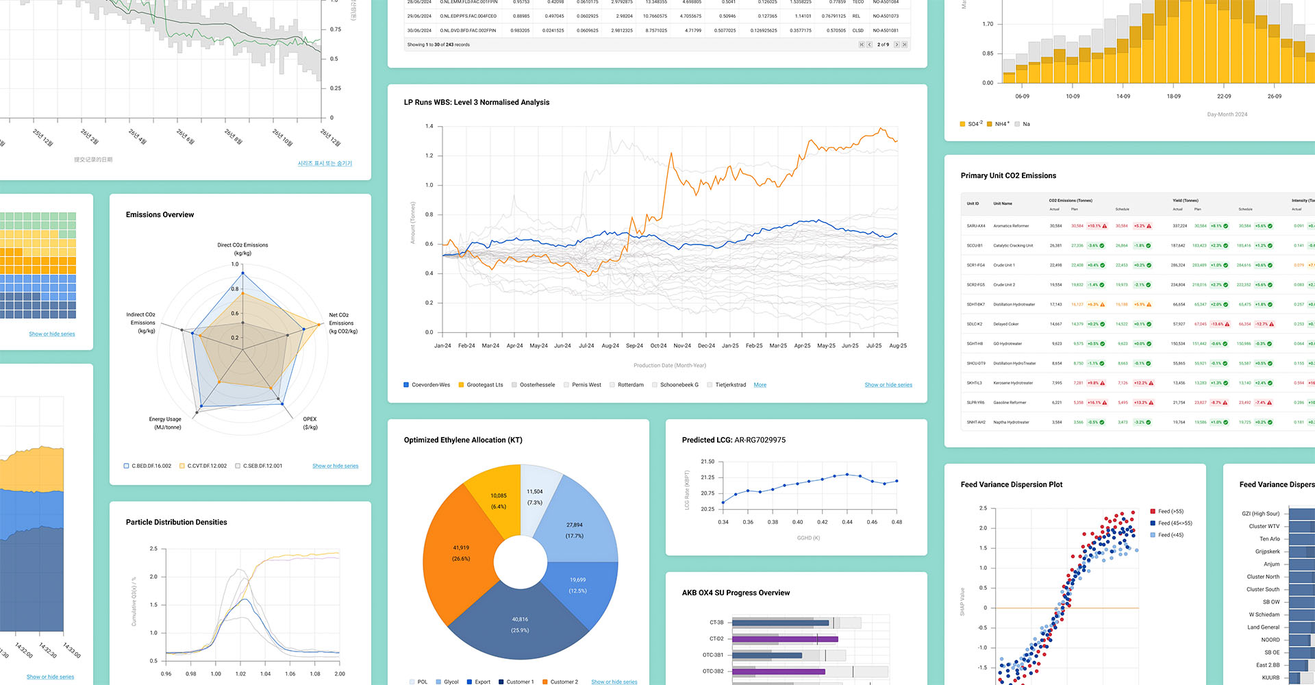
Aspen Enterprise Insights is a visualisation and workflow management SaaS platform used in Energy, Petrochemical and EPC (Engineering Procurement and Construction) industries.
I led the redesign of one of the product’s central features, Pipelines. In partnership with our product and engineering teams, I designed the new experience working closely with users to uncover insights and validate our approach throughout.
The Challenge
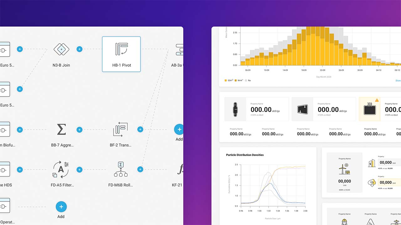
Developed to support a diverse range of use cases, the uptake and usage of Enterprise Insights is linked to the success of solutions built using the platform. One of the main toolsets involved in building solutions is Pipelines, where dashboard visualisations and analytics are prepared.
Our goal was to improve the Pipelines experience, enhance the functionality available, and make it easier for authors to create solutions that offer more value to users and help teams produce better results.
Discovery
The first step was to define the right goals for the project based on the needs, frustrations, and behaviours of users by understanding:
- How do the general tasks, goals and responsibilities of users vary and how does the product help, support or hinder?
- How does the Pipelines toolset fit into their wider workflows (internal and/or external) and what other steps, activities and tools are involved?
- What are users trying to achieve within the Pipelines toolset and how well are they able to do so?
- How usable is the current approach, what problems occur, and how are users affected?
- Which problems offer the greatest opportunity to improve the experience?
I planned and ran several phases of discovery that involved reviewing existing insight, a heuristic evaluation of the existing experience, and interviewing users.

Reviewing existing insight
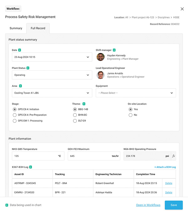
Our main source of existing user insight was a catalogue of interviews done as part of a program to support usage, adoption, and engagement. From these I was able to extract and collate relevant feedback which was combined first-hand feedback from feature requests and defect reports.
Together these gave valuable initial insight into a cross-section of users and their experiences.

Evaluating the current experience
To analyse the current flow and experience I defined the principles we’d test against, both during discovery and later as we developed the design, based on a set of the most relevant Jackob Nielsen Usability Heuristics.
This enabled us to establish a baseline we could benchmark against and provided useful context when processing and evaluating feedback from users.

User Interviews
I interviewed a cross section of users matching our top-level content creator profile including data visualisation specialists and everyday enthusiasts. The goal was to find out:
- How they use the product (and specifically the Pipelines toolset) as part of their roles and what are their typical workflows.
- Where do they feel there are challenges with the current Pipelines toolset and opportunities to improve
We could see that users wanted, and were trying, to do much more within the toolset than originally envisaged. It was clear from the challenges being faced that the existing single-thread wizard-based flow didn’t align well with the more non-linear way in which people worked, and that specific tasks often consumed the bulk of their efforts. Together these findings formed the basis of our approach.
Definition
With a clearer understanding of the problems to solve we defined our initial success measures and goals around 3 core ideas:
- How can we improve visibility by making the experience more visual?
- How we do to align the flow more closely to user’s mental model of data preparation?
- How can we provide direct feedback so that users can instantly see the effect of each action and easily recover from errors?
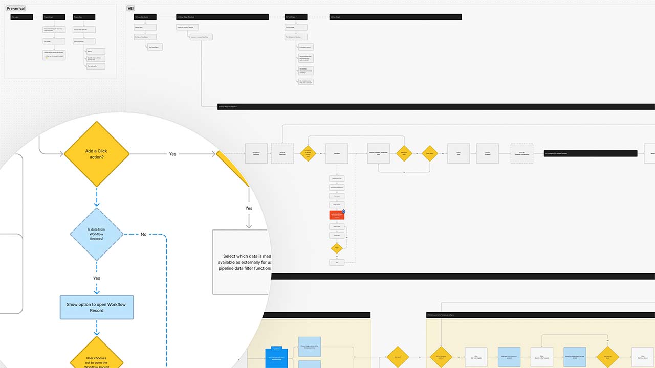
Having mapped the current experience I began exploring, prototyping, and testing different ideas and approaches. This helped us to establish our overall direction, map out our user stories and plan how to approach the next phase.

Design and Prototyping
Whilst workflows involved multiple steps and levels of configuration, we’d seen how users spent much of their time and focus preparing their data. It was here where saw them really pushing to do more and inevitably encountering challenges, and so was where we started.

Prototyping and testing through-out provided invaluable feedback, especially when focusing in on specific flows and process, including each of the operations used to gather, combine, and shape data. Approaches such as asking users to demo the operations in other tools highlighted what worked well, where they struggled and their mental models.
Designing for complex operations
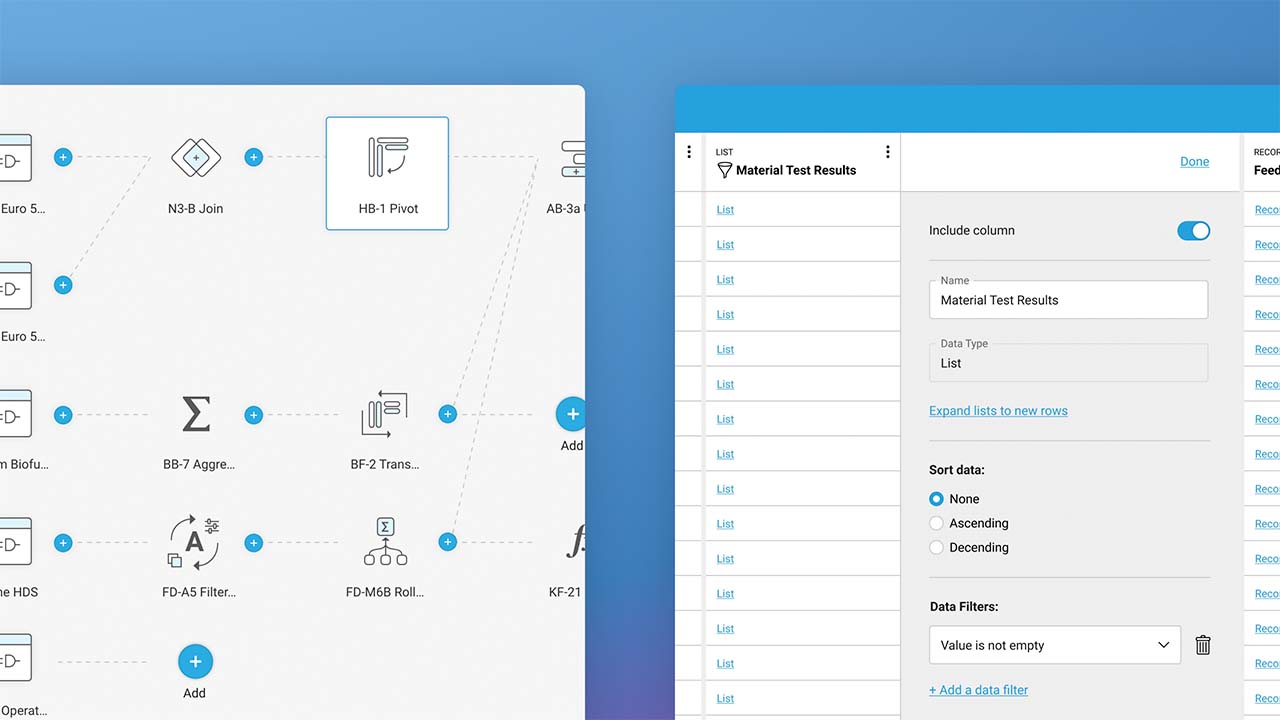
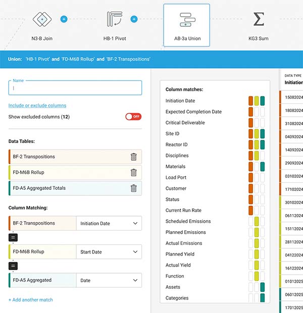
For more cognitively complex data operations, providing immediate ‘in-situ’ feedback transformed the experience. There were some challenges but working closely with engineering we achieved a smooth experience and refresh behaviour that didn’t interrupt their flow.

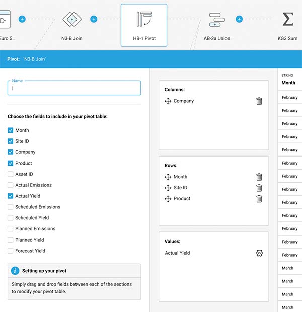
When operations drastically reshaped the data, it was the ability to quickly flip between the original and shaped ‘output’ data, without having to go back and forth between separate steps in their flow, that unlocked the usability of the experience.

Creating a connected experience
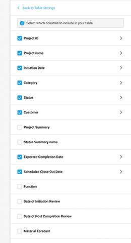
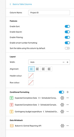
Orientating the experience around the creation and control of a visual flow diagram representing each stage of the preparation process helped users track, check, and change each step much more intuitively.
We built on this approach as we returned to the broader experience and solving how users move between preparing and using their data. It proved very natural for users to be able to add, see and configure visualisations and automated actions from within the visual flow.
Launch & onboarding
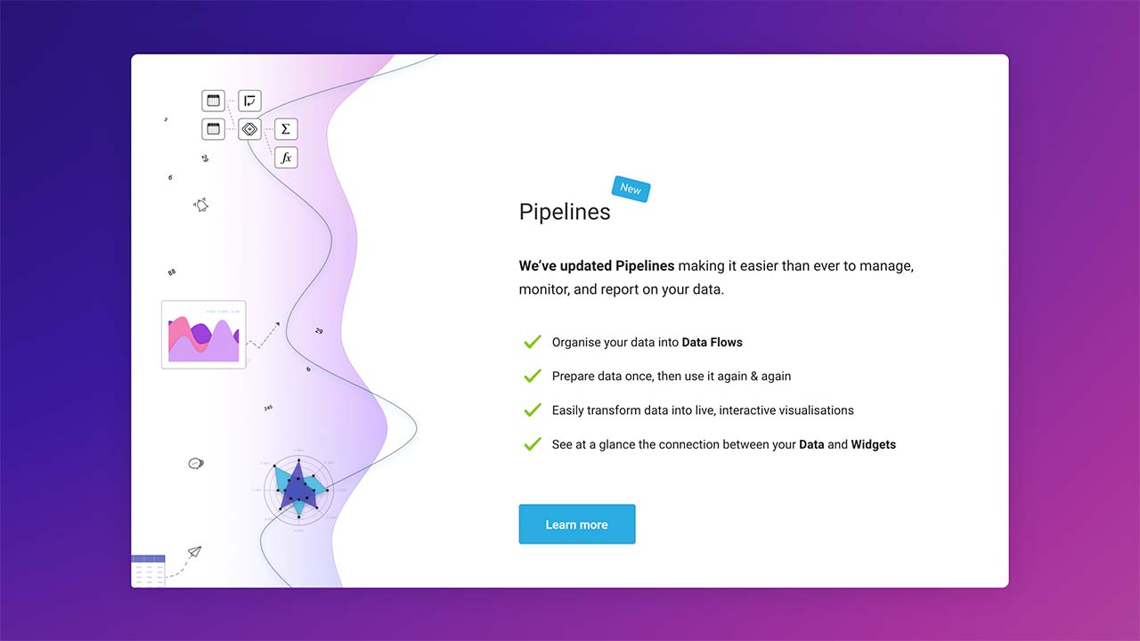
Knowing it would be a big change for some we carefully planned how we’d release and onboard the updates to make the most of the opportunities it offered, course correct where necessary, and reduce any associated risks.

Results
The response from our users was fantastic and our redesign proved very successful. Post release interviews with users highlighted how the affordances created, especially around data preparation, had transformed workflows, the flow through tasks and how they were structuring projects.
Over the 9-12 months following launch our core metrics continued to steadily improve and we seeded a program of projects that continued to develop the feature as users wanted to do more.

Reflection
The success of the new experience brought with it some challenges of its own. Finding it easy to use, users naturally brought more of their data workflows into the product earlier, often much more than anticipated, which on occasion had unintended consequences.
Whilst we’d factored it in, we found that as users developed more complex data-intensive solutions, we needed to provide more guidance, proactive feedback, and ways to test performance in-situ.
